Stan Lee's Verticus
Mobile UX, Game Design, and Interaction Design
Controlled Chaos and Moonshark partnered to take our Lead Programmer's weekend project and turn it into a year long multi platform free-to-play release. The game is narrated by Stan Lee himself.
The game is available for download on the app store.
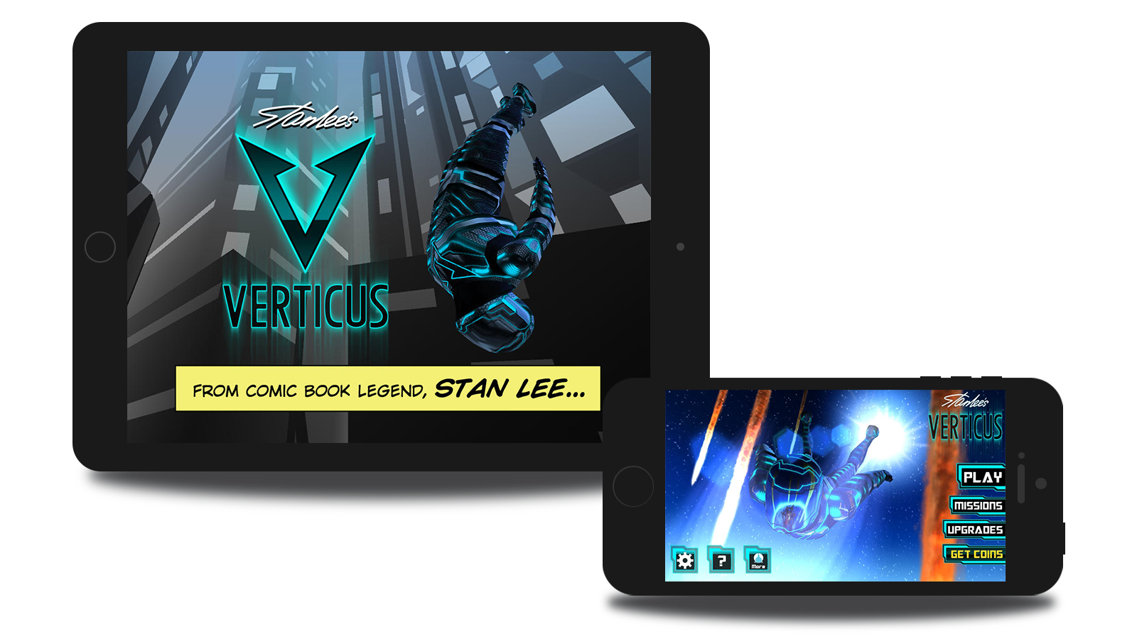
I was Lead Designer on Verticus, an Endless Runner style game for iOS. The game puts the player into the role of Verticus, a free-falling super hero with a supersonic armored suit. In Verticus, the player is guided by the Mission Commander, an exuberant narrator voiced by comic legend Stan Lee.
The Project
Verticus started as an internal game prototype at Controlled Chaos Media, where I was Lead Designer and the first hire. Our lead programmer created the prototype in a few days, creating the seed of a new IP opportunity.
Our Studio Director Hunter Woodlee took the idea, originally dubbed "Freefaller", and pitched it to Moonshark as a super-hero game. Moonshark, a company attached to CAA, had direct lines to Stan Lee.
My Role: Lead Designer
As Lead Designer, my challange was to take Freefaller and design a top tier mobile title.
- I helped build the pitch and present the prototype to our partners to ensure that the Talent would attach to the project
- Lead development of our Monetization Strategy
- I guided development during production and post-launch.
- I created wireframes and flows for the entire game UI, as well as player states and AI behaviors
- Designed moment to moment gameplay, working with programmers and artists to realize our vision
- I created UI screens in Unity (NGUI), and developed an analytics strategy implemented using Flurry
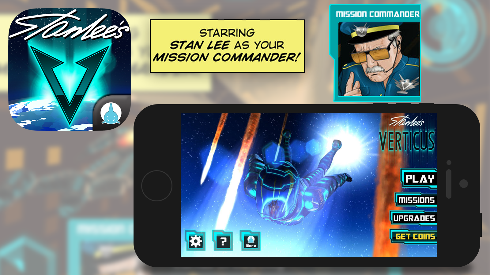
Verticus app icon, comic illustration of Stan Lee as 'Mission Commander', the in-game narrator. Modeling, Texturing, and Visual Design by Mike Penrod.
Our Aspirations
- Free-flowing moment-to-moment gameplay that captured a real sense of speed
- An in-depth player ability system with multiple upgrade tiers
- A compelling skill-based boss battle
- Implementation of a great "pinch" - the moment in a free-to-play game when engaged players decide to purchase
- Streamlined flow between the time a player inevitably "died" and when they could start playing again
- High quality visual goals, such as interactive 3d diorama style menus
- A comprehensive event system to utilize analytics in a way our company had not yet achieved
- An interactive guide for the player with a friendly and familiar voice
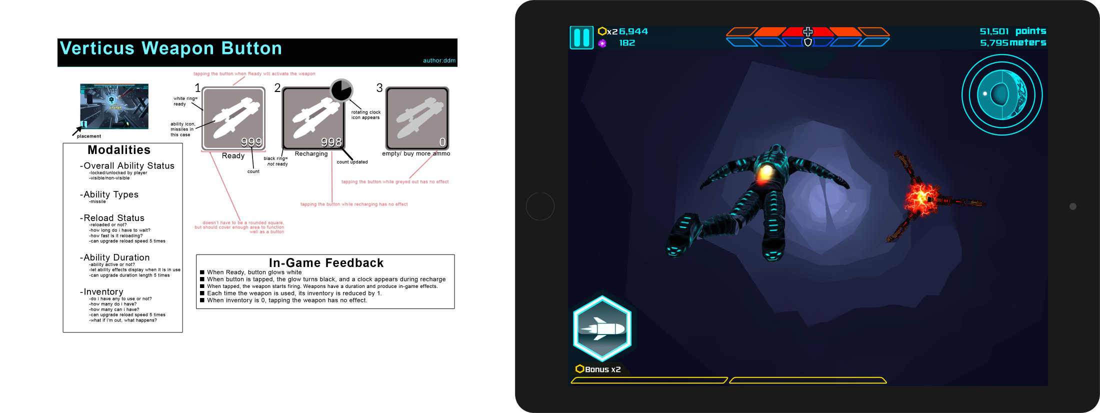
Left: An example of the type of documentation I created during development of Verticus. The verticus 'weapon button' appeared once the player unlocked a weapon using in-game currency. Right: In-game screenshot with HUD, including the weapon button.
Process
Market and User Research
At the time, there were few 3rd or first person Endless Runner games, so inspiration was drawn from previous similar 2d side-scrolling titles.
Contrasting other "lane-based" similar 3d action titles, we found that players really loved the ability to move gracefully across the screen in a very 1:1 fashion.
Through excellent gameplay programming from Jon Day, and character art and animation from Mike Penrod, we were able to craft a dynamic and delightful superhero flight model.
Defining Features
After carving out our problems to solve, I sketched and created wireframes in photoshop.
I created detailed Technical Design Documentation for the UI and game elements such as Artificial Intelligence, player abilities, weapons, and environments.
As a result of gameplay testing and iteration, new features sometimes start to "appear". I managed expectations with the publisher and team, yet kept my ears open for promising alternate directions.
Product Management
I engaged in daily briefs with our publishing partners, informing them of design changes and incorporating their feedback.
When we noticed our users revisiting certain screens in between gameplay sessions, we devised a plan to change the flow of the app slightly.
In order to facilitate faster replayability and less time between sessions, we gathered the most commonly visited functions and presented them to the player in a "Ready Screen" before each game playthrough.
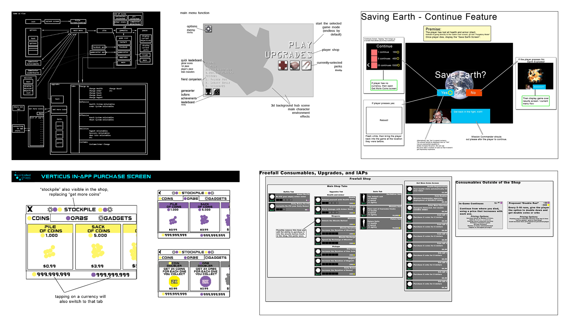
I created flows and wireframes such as this prior to development, or on-demand as features changed during development. Top-Center: Initial wireframe for the main menu screen. Features and layout changed as development progressed, but kept a dyanmic shadowbox style using in-game 3d assets with 2d menu overlayed on top.
Iteration
Part of our initial design was to give the player choices when starting a new run in the form of Suit Abilities. However this was not within our scope so they were put on hold. Late in development, I pitched the concept of Suit Abilities to the publishing team again, and we secured funding to extend development to add in the Suit Abilities and several other polish items.
Extending a budget is always both a blessing and a curse. It gave us the resources to deliver on the vision of the game, but requires careful management to ensure the new features dovetail in development with all of the existing work that was left to be done.
By this point, the team was able to move very quickly. Fully mocking up some screens was done to keep everyone on the same page, as features piled in.
Many features went directly into Unity at this point rather than through a number of flows and planning docs. Our pipeline was hammered into shape, and we were firing on all cylinders.
However, a number of key elements were not given priority, and we overestimated our ability to deliver polished gameplay in our first release.

Screenshots of in-progress Photoshop mockup and UI development in Unity of Verticus Suit Abilities
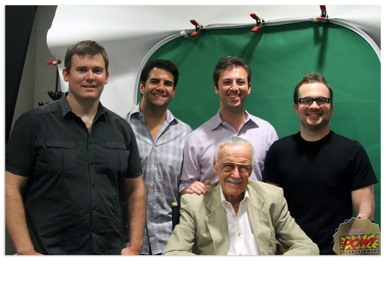
Controlled Chaos and Moonshark with Stan Lee at a Voice Recording Session at CAA in Los Angeles
Lessons Learned
The process of building and releasing Verticus was an amazing learning experience.
During and at the end of each project, I collect and wrestle with our design process, development mistakes, and highlight what we did well. It's been beneficial to me throughout my career to do this exercise on a personal, team, and organizational level.
When we started working on what would become verticus, the gameplay was very calming and zen-like. We strived to keep this featured as long as possible, but eventually the nature of an action-based comic book hero game had to take precedence. During the development, it wasn't clear if Stan Lee would sign on to the game, yet we were already in production. As a result, the game kept its calm roots for too long. This meant that we kept in the zen-like flowing controls, but also had to add in enemies, which were very difficult to avoid at high speed. In hindsight, we should have made a hard cutoff, and potentially kept the zenlike controls for another game.
Final Takeaways:
- Set yourself up for success by actively maintaining multiple new game prototypes you can turn to when an opportunity presents itself.
- When dealing with signed talent, design for multiple versions of the product, in case there is a twist in the deal-making proces that you don't have control over.
- When entering an established market, too many innovations can confuse the product for the average user. Familiarity is a good thing.
- Don't wait for permission to test anything with a potential user. Pair fearless testing with quick iteration to mold the project as you go.

